I have had numerous questions lately, all inquiring how I selected the fabrics for my Petal by Petal quilt (see previous post). I'll try to explain my process and inspiration.
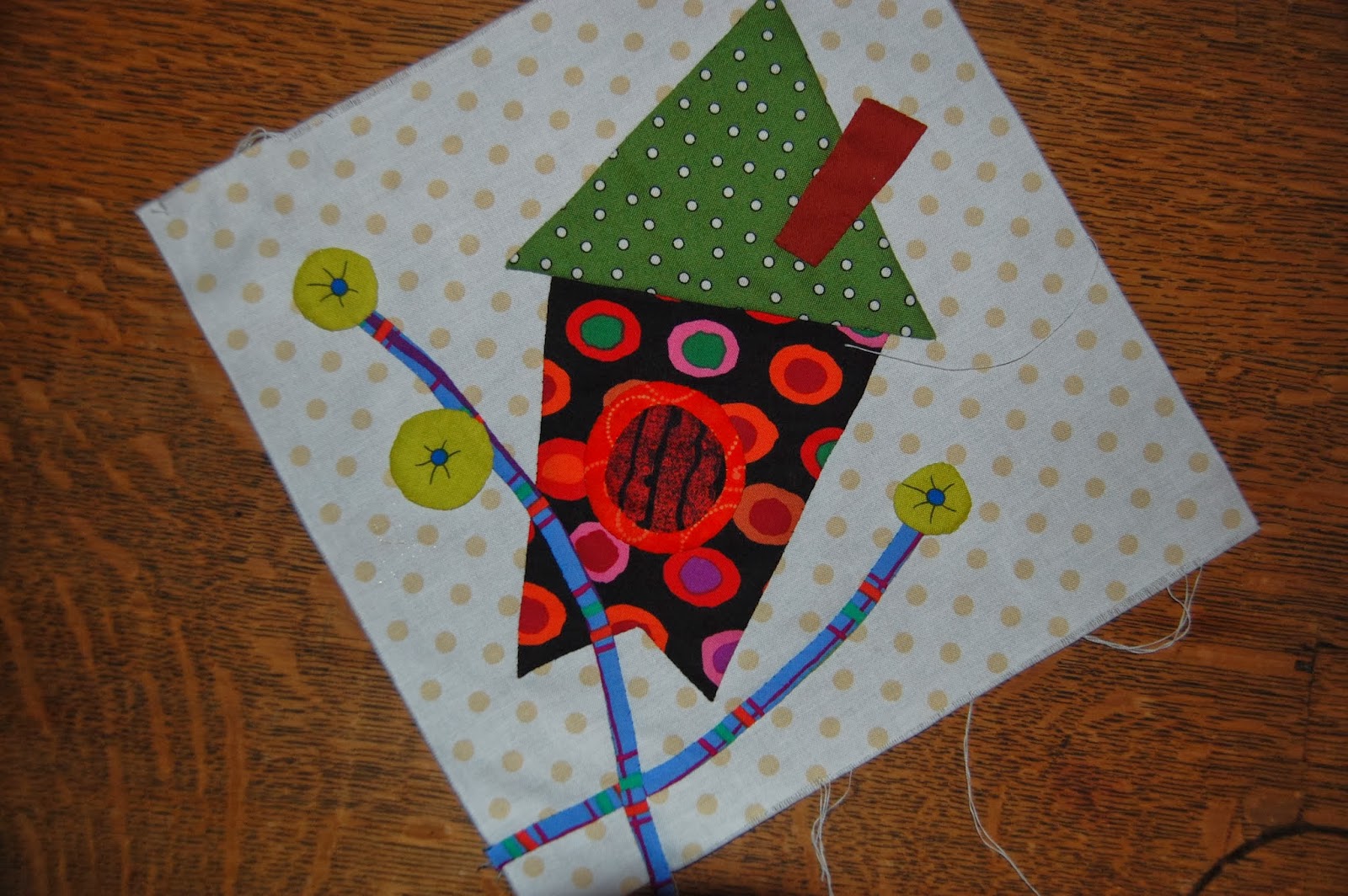

I bought a yard of the plaid (Westminster - Brandon Mably) for my stems and though I love the way it looks on the straight grain (on the birdhouse block) I knew bias was the best way to make it easy. Fortunately it was equally awesome.


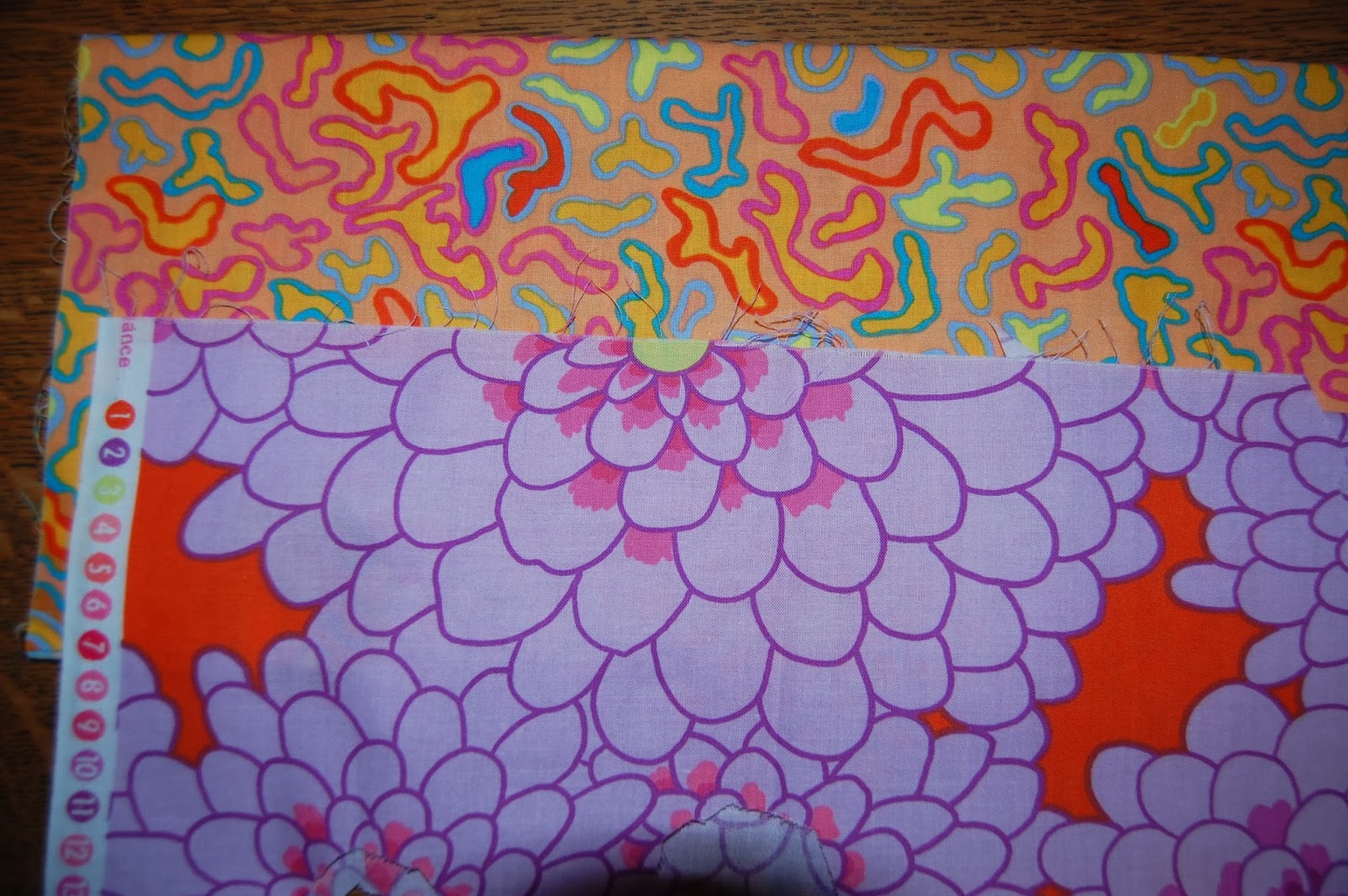
I wasn't finished with my quilt design at this point, I was just in the fabric collecting mode so I didn't feel anything needed to be set in stone. If I bought something that didn't work out it would just go into the stash. I purposed to find at least two patterned fabrics for each solid. The lighter stripe has the added bonus of a lavender stripe in it. The darker orange stripe looked great with the purple. I'm sorry there wasn't enough selvage to determine the manufacture but there are so many great stripes I would hate for anyone to limit themselves to these.

This lavender print is little rotary cutters. As hard as I searched I couldn't come up with the name of this line of fabric. I also chose a darker purple chevron piece that I used for the berries, evidently it isn't still in my stash.

Then by some miracle I found this amazing chevron print. I did NOT instantly see leaves here, that was a happy accident. This piece gets a lot of attention. It is a Westminster fabric (Fassett or Mably, I'm not sure which).
Of course I needed a few "blenders" and these two older Fassett prints work. They qualified because they both contained orange and purple.

So this is how they all looked together. There are at least three pieces missing here. The basket, the motif that ended up in the center of the orange round flower (seriously, any motif will work) and the dark purple berry chevron.

Finally, I chose the background print. The crisp white to really accentuate the bright bold color and the tan pattern to match the style of my design plan, besides breaking up a vast expanse of white.
I hope this answered any questions, feel free to ask if I missed something. My biggest hope is that anybody who decides to make the quilt would make it their own. Choose what you love and go for it!!
Happy Quilting,
Laurel
This tutorial is great and I love how vibrant your colors are. I am just starting quilting and honestly I need all the help I can get! Now that I have a better idea of how the fabric choosing process works I will go to one of the local fabric stores and peruse their brocades. Thank you and happy quilting! http://www.ruthsstitchery.com
ReplyDelete